Civic Tech
UX Research, Workshop Facilitation, Product Strategy & Documentation
TL;DR
A few months into the COVID-19 pandemic, the US Department of the Treasury launched the Emergency Rental Assistance (ERA) fund to assist households unable to pay rent and utilities due to the pandemic. States and counties throughout the nation scrambled to set up government services to intake and review applications, as well as distribute the funds for qualified applicants.
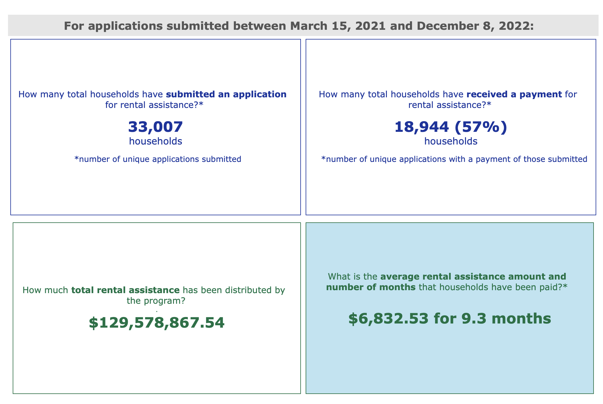
Deloitte was contracted for this project, and I was both UX research lead and product manager. Over 8 weeks, I worked with a project manager, UX/UI designer, and offshore developers to design the experience, content, and features for Allegheny County’s ERA system for residents and caseworkers on behalf. The system allowed residents and landlords to apply and track their application, while also allowing caseworkers to manage their caseload. In total, the county received just over 33,000 applications and distributed $129 million in rental relief to just under 19,000 households.
Goals
Support Allegheny County design a modern enterprise system where residents and landlords can apply without assistance and track their applications. While also allowing caseworkers to manage their caseloads efficiently without too much context switching.
Problem
Allegheny County was using Google Suite to manage the first phase of the Emergency Rental Assistance program (ERA-1) and was struggling to efficiently and effectively manage the caseload. They understood that not only did they need an enterprise system to manage the service, but it also needed to be well designed so as not to create additional friction for residents and caseworkers.
Constraints
The major constraints for this project included:
Because this project was at the height of the pandemic, I was not able to speak with residents directly. To overcome this, I met semi-weekly with a small team of caseworkers who interacted with residents daily and understood their lived experience and needs.
The project timeline for user research and delivering polished wireframes was condensed to 8 weeks. To overcome this, I worked closely with the product designer and developer lead to create a roadmap for how we could iteratively design the product efficiently.
Approach
My approach was a multi-pronged strategy.
Use the small team of caseworkers as power users, as they understand both their needs and the needs of residents and landlords.
Use familiar UI patterns to make the system more intuitive and habitual, while reducing the design cycle time. Examples of familiar UI patterns include the TurboTax side navigation for the application and a pizza tracker to visualize where the application was in the approval process.
Use the semi-weekly calls as participatory design activities to garner feedback, buy-in, and deeper insights fast.
Understanding our Users
Early on and throughout the project, I would reference and update our two main personas to ensure we were meeting the goals of our users, while reducing friction points.
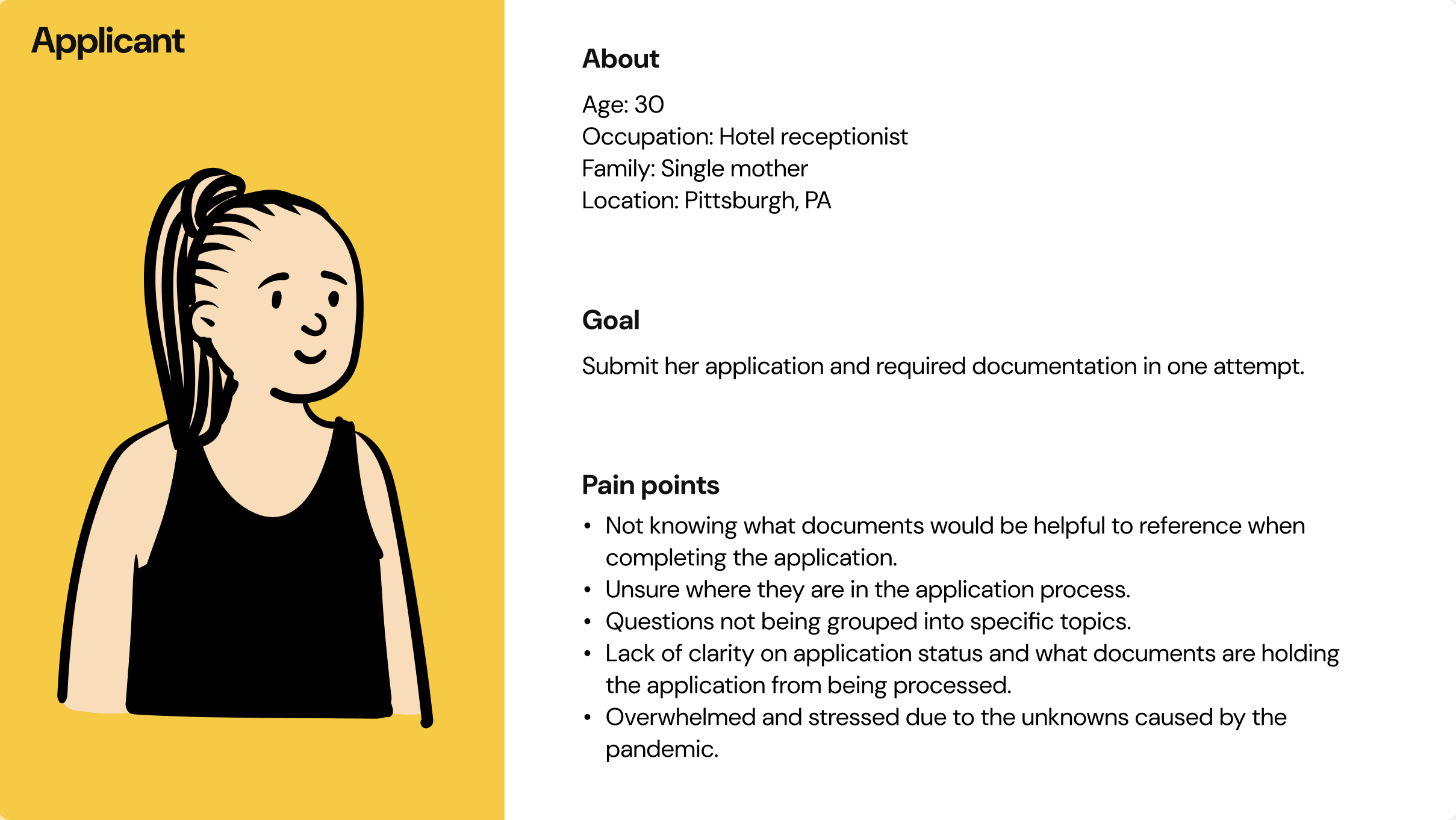
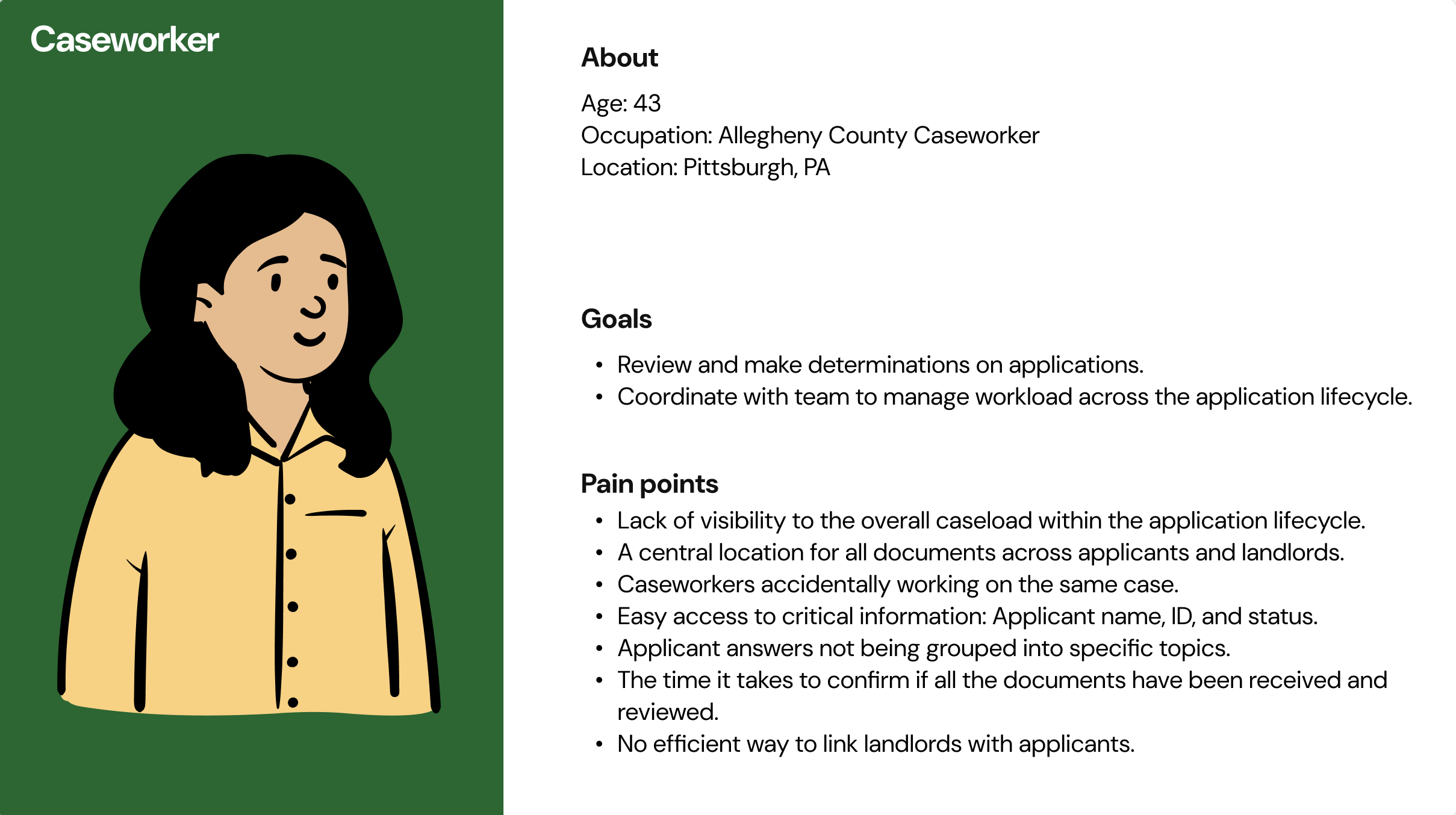
Mapping the User Experience
Unfortunately, I do not have visuals of this process, but in the first week I worked with the project manager to group the content into themes and outlined the UX workflows for both the resident and caseworker experience. The UX/UI Designer joined 2.5 weeks into the project.
Insights translated into designs, worfklows, and features
From week 3 to week 8, the findings from the semi-weekly calls with the caseworker team were used to iterate on the product. During this time, I used participatory design and usability testing to learn what was working and what could be improved. After the calls, I synthesized the findings and shared them with the product and developer teams to discuss what was feasible and viable.
Below are a few of the designs and features by user type that came from this collaborative approach.
Resident Designs & Features
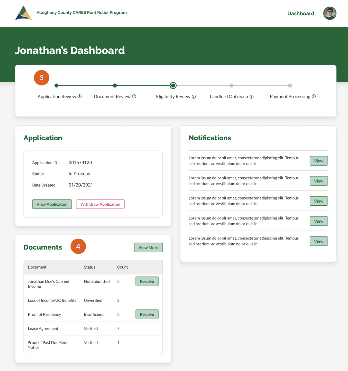
A static message across the application to help applicants know what information they need to complete the application successfully.

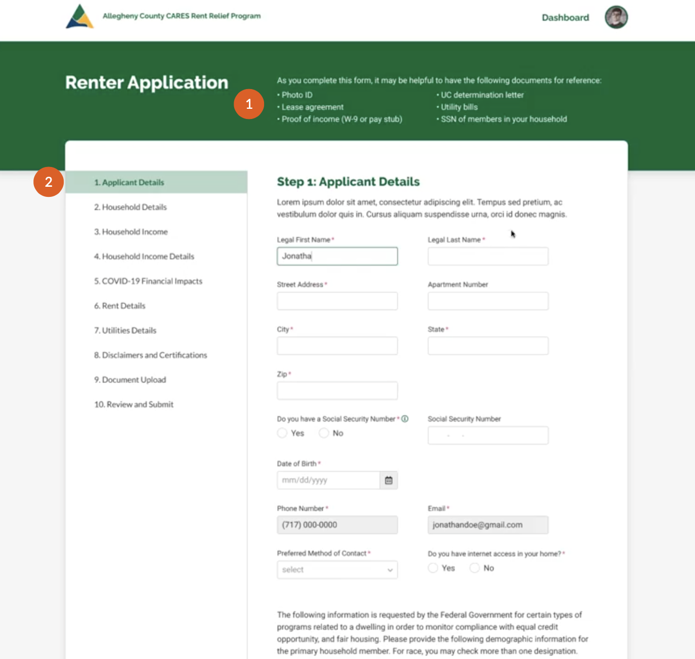
A step-by-step guided workflow design to support application comfort and usability.
Provides applicants with visibility into the stage of their application, reducing stress and call volume.

Allows applicants to easily resolve missing documents without caseworker support, increasing efficiency while reducing call volume.

Caseworker Designs & Features
Provides a bird's-eye view of the caseload to help caseworkers and supervisors work as a team.

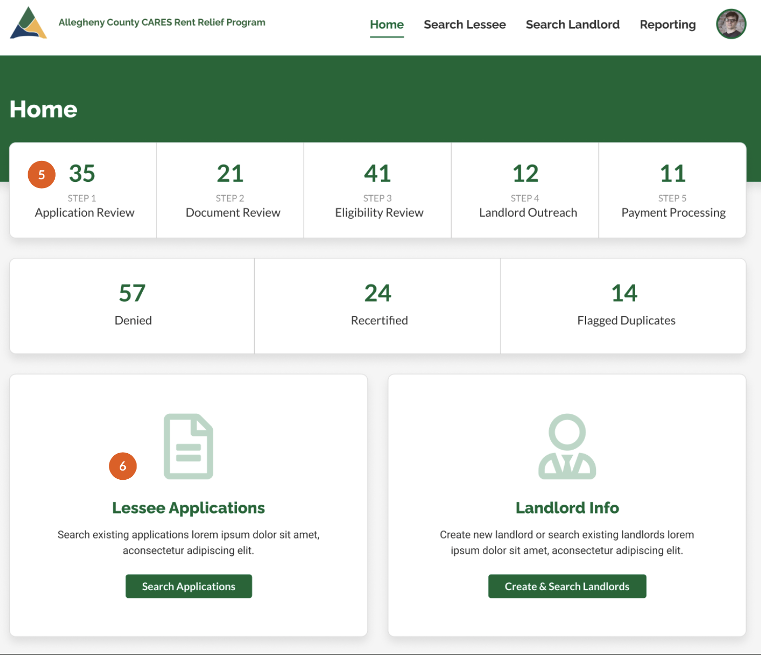
The ability to search for applicants and landlords separately as there were edge cases where a landlord may also be a lessee.

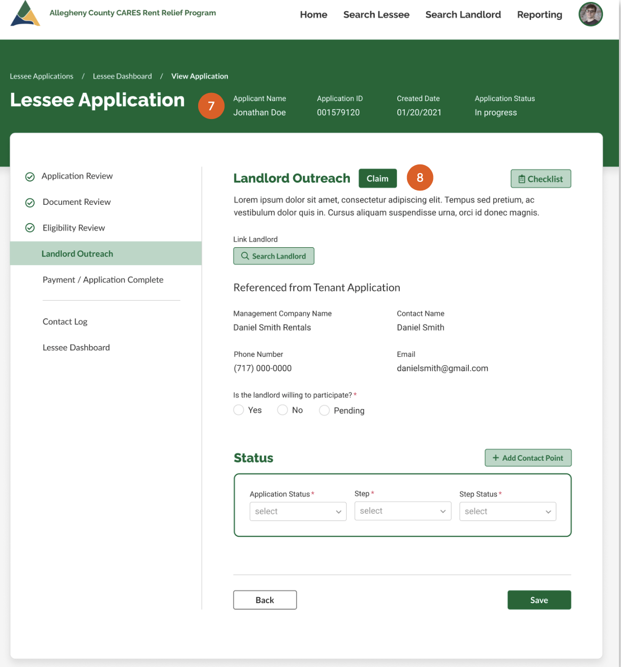
Key applicant data on each screen to support caseworkers who often context-switch.

Caseworkers must claim a case to reduce errors and data corruption.

Outcomes
The Allegheny County emergency rental assistance website launched on March 15, 2021, and by August 30, the county had distributed roughly $30 million in rental relief across 5,000 households. During that time, the county allocated over 50% of its funds, compared to the national average of 10%.
From March 2021 through December 2022, nearly 19,000 households received payments, and $129 million was distributed.
Tenant video of the application
Caseworker video of the case management
Learnings
A few of the learnings I had on this project include:
How momentum grows when stakeholders are brought into the process through weekly workshops and prototyping activities.

How to leverage familiar UI patterns and UX flows to improve usability. Our designs and content strategy were inspired by TurboTax, which helped make the system more familiar for caseworkers and residents.
How impactful digital usability can be in making civic government systems efficient and effective for their users.